Start with letters, not a finished quote
Hand lettering is the practice of drawing letters with attention to their shape and arrangement. It is tempting to begin with a long inspirational phrase, complete with flourishes and decoration. That gives you many decisions to make at once: letter shapes, word spacing, line breaks and composition. If the result feels awkward, it can be hard to tell which decision caused the problem.
Start smaller. Choose one alphabet style you like and draw a few letters at a comfortable size. Then try short words that repeat those letters. A word such as “minimum” is useful for noticing rhythm between similar strokes; your own name may be more motivating to repeat. Once the individual letters feel more predictable, move on to a short phrase. This is not a rule about what you are allowed to make. It is a way to give yourself a clearer problem to solve.
Watch for drifting shapes and uneven spacing
One common mistake is to judge each letter in isolation. A beautifully drawn letter can still look out of place if it is much wider, taller or more slanted than its neighbors. Lightly draw a baseline for the letters to sit on and another guide for the height of lowercase letters. You can add a guide for taller letters if needed. These lines make it easier to see whether a change in shape is deliberate or accidental.
Spacing needs similar attention. Equal distances between the outer edges of letters do not always look equal because letter shapes leave different amounts of open space. For example, a round letter beside a straight one may need to sit closer than two straight letters. Try drawing a word, stepping back from the page, and looking at the spaces rather than the letters. Mark any gaps that seem too wide or crowded, then redraw the word with one adjustment at a time. Compare both versions before deciding whether the change helped.
Let the tool suit the exercise
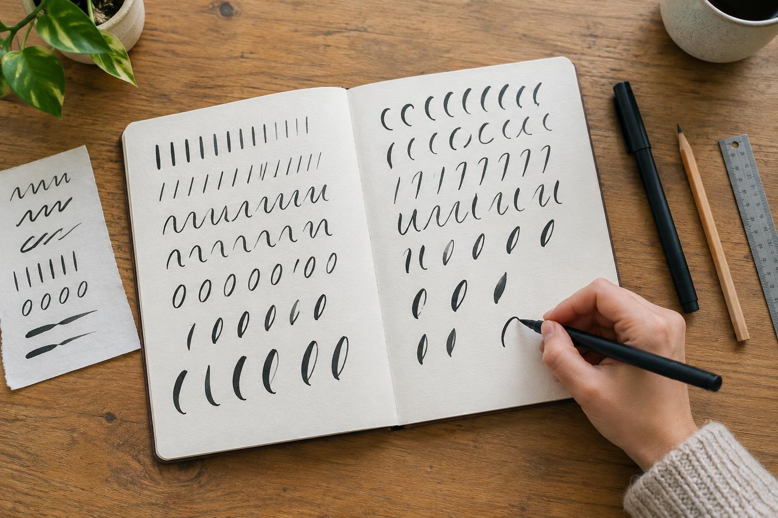
Another beginner trap is assuming that a particular pen will produce a particular style on its own. A brush pen can create thick and thin strokes, but controlling it takes practice. Pressing hard throughout a letter may make the strokes heavy and tiring; moving too quickly may make curves difficult to control. If you are using a brush pen, practice a few slow downward strokes with more pressure and upward strokes with a lighter touch. Pause when your hand becomes tense, and use paper that lets the pen move comfortably.
A pencil or ordinary fineliner is also enough to learn composition, proportions and spacing. You can draw the outline of a thick stroke and fill it in later, a method often called faux calligraphy. This separates the task of designing a letter from the task of controlling pressure. Instead of buying more supplies when a page disappoints you, identify what you want to practice next and choose a tool that makes that exercise manageable.
Avoid decorating problems you have not solved
Shadows, flourishes and color can be enjoyable, but they can also hide a basic issue until a piece is nearly complete. Before adding them, check whether the words are readable at a glance. Are similar letters built in a similar way? Is there enough room between words? Does the phrase fit the page without a cramped final line? A simple pencil draft can answer these questions more easily than a polished drawing.
When a layout does not work, resist the urge to start over without looking at it. Circle one specific problem, such as a word that is too wide, and make a second draft that addresses only that problem. Keeping imperfect drafts gives you something to compare. It also turns mistakes into information rather than evidence that you are “bad at lettering.”
Build a practice routine you can repeat
Steady practice does not require a finished piece every day. Try a short session with three parts: warm up with a few lines or curves, work on one letter or spacing problem, then draw one short word using what you noticed. Choose a session length that fits your week, even if it is only ten minutes. A small, repeatable routine is more useful than an ambitious schedule you rarely have time to follow.
Date your practice pages and write one brief note about what you tried. After several sessions, look for changes across pages rather than judging your latest attempt against someone else’s finished work. If you keep making the same mistake, narrow the exercise: practice just the curve, join or pair of letters that causes trouble. Leave room for playful projects, too. A handmade label or card gives your practice a purpose without requiring every stroke to be perfect.